With a specialist website, selling one product or category of products, thinking early on about the best way to present products can be beneficial. Not only will you improve usability and conversion rate from the start but it’s an opportunity to make the site stand out from competitors, both the not-as-well-designed specialist shops and the more general retailers using the same layouts to sell a huge variety of different products.
Two contrasting examples I’ve worked on are cutlery and umbrellas.
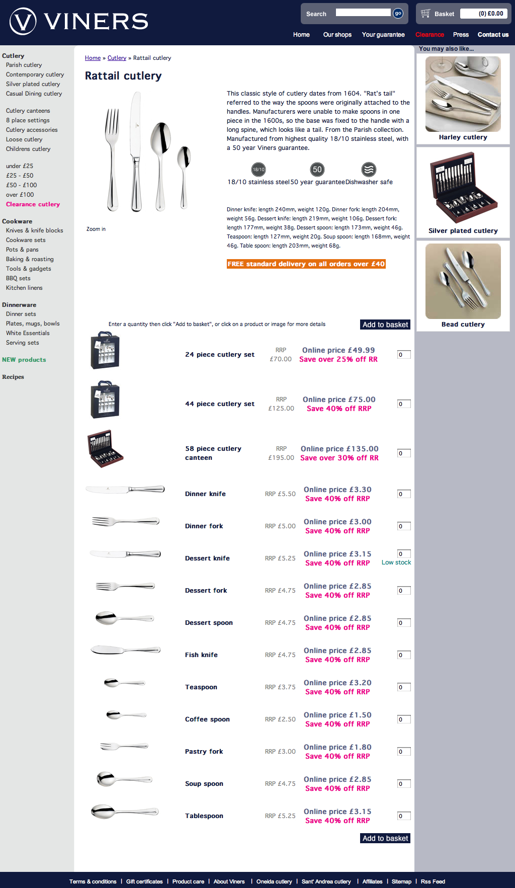
In the first example, Viners cutlery, I was responsible for the design. Through looking at other websites selling cutlery (good and bad), and understanding patterns of sales through the company’s other sales channels, I made sure each cutlery range was presented with a means of ordering cutlery sets and loose pieces all on the same page (without having to go back and forward to the shopping basket).
Hence this page…

… is the same in terms the product hierarchy as this page…

The difference being, a customer is much more likely to purchase more than one product from a range of cutlery (e.g. some knives and some forks, or a cutlery set and some extra teaspoons). With cookware, it’s less likely a customer would want to purchase more than one saucepan. And there’s more detailed information on a saucepan on the product detail page a customer would want to see before making the purchasing decision.
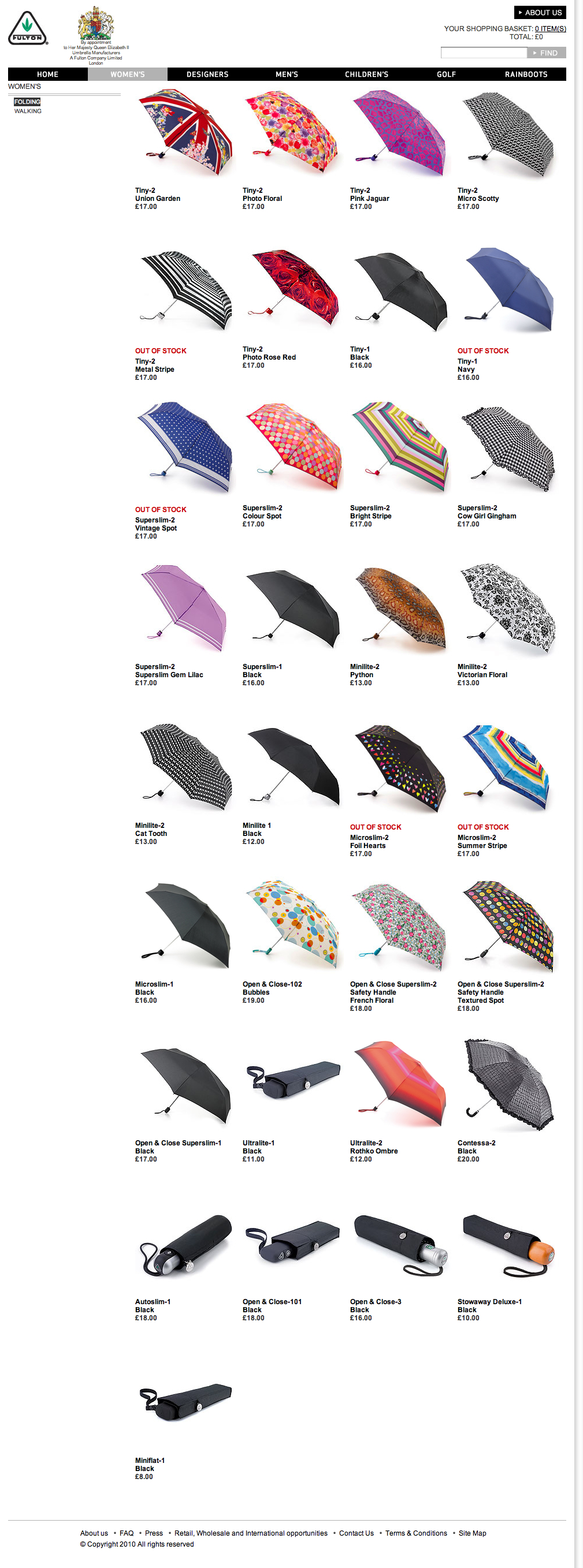
In my second example, Fulton Umbrellas, my involvement was much further down the line, when the design was almost complete. The first design I saw showed around 10 umbrellas on the womens page, mostly black and with technical descriptions like Superslim-1 and Open and Close – 3. This was the way the company presented the range to trade customers, but obviously not the optimal way on B2C online shop; because consumers don’t know the difference between a Superslim and an Open and Close, and because a consumer looking at that page wouldn’t know unless they clicked on it that the black umbrella pictured came in 10 different designs.
Unfortunately the ecommerce platform chosen was limited in the filter and sort views available; the ideal solution would have been to allow the customer to view by type, by colour, by pattern, by price etc. however, the least-bad option for launch was to show all the products.
