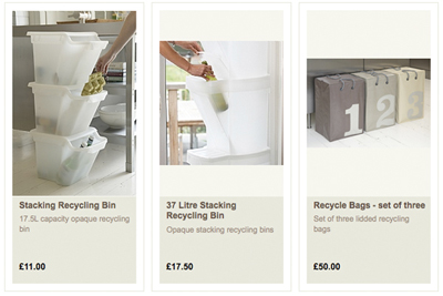
Most online shops standardise the dimensions of thumbnail images – for obvious reasons of neatness. In fact, by default most thumbnail images are either square or slightly portrait.
But what happens if you have a wide range of products and hence images – long and thin products, and short and wide products? How do you maximise the impact of the images whilst avoiding a lot of white space?
Two solutions I’ve found are:
The Holding Company – all images are 170px width, but heights range from 100px to over 300px. This works because the images are vertically-centered on a background colour, balanced with a large text box at the bottom.
Moss.co.uk – images are all the same width 185px and either 429px tall (full length – suits and trousers) or 215px (tops and accessories). Within each category images are likely to be the same type, so there’s a uniformity – you either look at all the suits together, or all the shirts together. An exception is the search results (e.g. I searched for “blue”products), but the designers have obviously weighed up the benefits of large, full thumbnail images vs the likelihood of seeing slightly messy search results. Besides, search results by default group the types of products together, and even price-based results will group similar products e.g. suits together.

